Charts
One of the main features of the report is their ability to draw charts. To incorporate charts into a report the cha namespace is defined in the Report.
<rep:Report
  xmlns:rep="http://safe.epcc.ed.ac.uk/report"
  xmlns:par="http://safe.epcc.ed.ac.uk/parameter"
  xmlns:per="http://safe.epcc.ed.ac.uk/period"
  xmlns:fil="http://safe.epcc.ed.ac.uk/filter"
  xmlns:cha="http://safe.epcc.ed.ac.uk/chart">
In the most simple terms a chart plots one of the numeric properties of a group of selected records. The record are selected using Filters and a Period.
Plot
A chart showing the usage (Wall) of a machine could be done as shown.
<cha:TimeChart>
        <cha:Plot>Residency</cha:Plot>
</cha:TimeChart>
This chart would be:
Any numeric property can be plotted, however it requires a corresponding PlotEntry to be defined.
Group
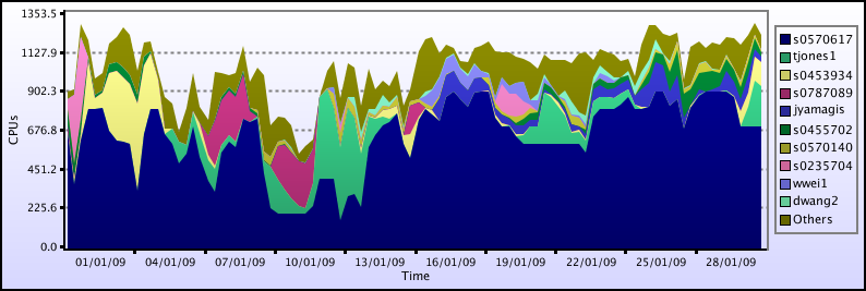
In order to draw a chart which shows the Residency of each Project, you need to GroupBy Project. The following chart
<cha:TimeChart>
        <cha:Plot>Residency</cha:Plot>
        <cha:GroupBy>Project</cha:GroupBy>
</cha:TimeChart>
This chart would be:
Any property can be use in group a plot, numeric or string, however it requires a corresponding GroupEntry to be defined.
Periods
The charts above show the Residency for a certain time period. In their case the default time period is used, which is from the start to the end of the current month. You can explicitly set the period by adding a period to you chart definition. For example:
<cha:TimeChart>
        <per:Period>
                <per:StartTime>01-01-2009</per:StartTime>
                <per:EndTime>01-03-2009</per:EndTime>
        </per:Period>
        <cha:Plot>Residency</cha:Plot>
        <cha:GroupBy>Project</cha:GroupBy>
</cha:TimeChart>
As you can see from the name all of these charts are TimeCharts, and they expect a Period to be defined which they will operate over. Period can be defined anywhere in a reports, but the Period used for the chart is the closest one. For example, in the following report
This chart would be:
In fact the period does not have to be defined within the plot. The example below the period used for the plot will be from 01-01-2009 to 01-01-2010 as defined for the whole report.
<rep:Report
  xmlns:rep="http://safe.epcc.ed.ac.uk/report"
  xmlns:par="http://safe.epcc.ed.ac.uk/parameter"
  xmlns:per="http://safe.epcc.ed.ac.uk/period"
  xmlns:fil="http://safe.epcc.ed.ac.uk/filter"
  xmlns:cho="http://safe.epcc.ed.ac.uk/chart">

        <per:Period>
                <per:StartTime>01-01-2009</per:StartTime>
                <per:EndTime>01-01-2010</per:EndTime>
        </per:Period>

        <cha:TimeChart>
                <cha:Plot>Residency</cha:Plot>
                <cha:GroupBy>Project</cha:GroupBy>
        </cha:TimeChart>

</rep:Report>
The plot will pick up the nearest period. In the example below there are two periods defined. The period used in the chart will the one from 01-01-2009 to 01-03-2009.
<rep:Report
  xmlns:rep="http://safe.epcc.ed.ac.uk/report"
  xmlns:par="http://safe.epcc.ed.ac.uk/parameter"
  xmlns:per="http://safe.epcc.ed.ac.uk/period"
  xmlns:fil="http://safe.epcc.ed.ac.uk/filters"
  xmlns:cha="http://safe.epcc.ed.ac.uk/chart">

        <per:Period>
                <per:StartTime>01-01-2009</per:StartTime>
                <per:EndTime>01-01-2010</per:EndTime>
        </per:Period>

        <cha:TimeChart>
                <per:Period>
                        <per:StartTime>01-01-2009</per:StartTime>
                        <per:EndTime>01-03-2009</per:EndTime>
                </per:Period>
                <cha:Plot>Residency</cha:Plot>
                <cha:GroupBy>Project</cha:GroupBy>
        </cha:TimeChart>

</rep:Report>
Filters
The charts above show the Residency over the whole data set. A filter could be defined to narrow the selection of usage records, say down to only one project, ecdf_baseline for example. The you may wish to group by User. This plot would look like:
<cha:TimeChart>
        <fil:Filter>
                <fil:EQ>
                        <fil:Property>Project</fil:Property>
                        <fil:Value>ecdfbaseline</fil:Value>
                <fil:EQ>
        </fil:Filter>
        <cha:Plot>Residency</cha:Plot>
        <cha:GroupBy>User</cha:GroupBy>
</cha:TimeChart>
This chart would be:
As with Periods Filters do not have to be defined within the plot. All of the Filters defined within chart or one of its parent XML elements will be combined. So in the case of this chart:
<rep:Report
  xmlns:rep="http://safe.epcc.ed.ac.uk/report"
  xmlns:par="http://safe.epcc.ed.ac.uk/parameter"
  xmlns:per="http://safe.epcc.ed.ac.uk/period"
  xmlns:fil="http://safe.epcc.ed.ac.uk/filters"
  xmlns:chart="http://safe.epcc.ed.ac.uk/chart">

        <fil:Filter>
                <fil:EQ>
                        <fil:Property>Project</fil:Property>
                        <fil:Value>ecdfbaseline</fil:Value>
                <fil:EQ>
        </fil:Filter>

        <cha:TimeChart>
                <fil:Filter>
                        <fil:EQ>
                                <fil:Property>User</fil:Property>
                                <fil:Value>paddymurphy</fil:Value>
                        </fil:EQ>
                </fil:Filter>
                <cha:Plot>Residency</cha:Plot>
        </cha:TimeChart>

</rep:Report>
The selection used will be only those of the User paddymurphy for the Project ecdf_baseline.
TimeChart
So far all the charts we've been looking at have been TimeCharts. There are other chart types supported: PieTimeChart and BarTimeChart, but first lets look at a feature unique to TimeCharts, namely NumberOfTimeBlocks which dictates how many time slices there are in the chart. By default it is 10, but this can be changed using the NumberOfTimeBlocks tag. For example:
<cha:TimeChart>
        <cha:Plot>Residency</cha:Plot>
        <cha:NumberOfTimeBlocks>20</cha:NumberOfTimeBlocks>
</cha:TimeChart>
would result in the following chart:
PieTimeChart
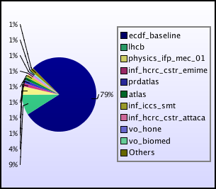
As mentioned previously PieTimeCharts are also available. The following xml:
<cha:PieTimeChart>
        <cha:Plot>Residency</cha:Plot>
        <cha:Group>Project</cha:Group>
</cha:PieTimeChart>
would produce the following chart:
BarTimeChart
For a BarTimeChart the following xml:
<cha:BarTimeChart>
        <cha:Plot>Residency</cha:Plot>
        <cha:Group>Project</cha:Group>
</cha:BarTimeChart>
would produce the following chart:


